Hitting “Refresh” — Announcing Pro-Life Wisconsin’s New Logo
You may have noticed something different…
You may have noticed something different, something new, about us. If you think our logo looks familiar but not quite the same, that’s it! You’ve got it!
About a year ago, our generous partner, Sorvick Studios, approached us to offer their services to create a new logo for Pro-Life Wisconsin. Our logo at the time was already 10 years old, and offered some limitations when creating digital art. Therefore, a NEW logo was born out of the old to help us continue to promote LIFE in Wisconsin in this age of digital communication. So here’s what you need to know:
The old logo features three main parts that tell our story as an organization.
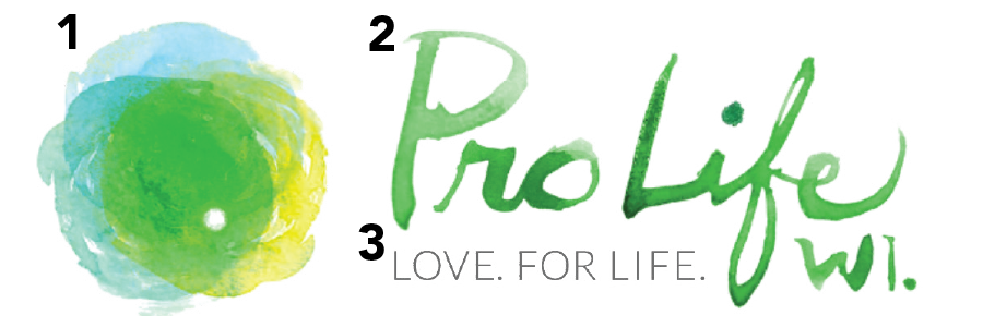
THE OLD LOGO
The icon (“orb”) represents a fertilized egg/human at conception.
Our brand name stylizes “Pro-Life Wisconsin” as “Pro Life WI.” and showcases our mission and geographic location.
The tagline “Love. For Life.” sums up and reiterates our mission.
The new logo features the same three key components as the old logo while also expanding upon the latter to continue to communicate our mission going forward.

THE NEW LOGO
First, the icon (or “orb”) showing fertilization also represents our three pillars: “Educate. Activate. Legislate.” Our location is featured here, too. Yellow and green are iconic Wisconsin colors, and blue recalls Lake Michigan. Finally, simple shapes make it easier to use our logo in digital and print media.
Second, our brand name features Wisconsin all spelled out, as opposed to just the abbreviation “WI” to make us more accessible to our increasingly national/international audience (think social media!).
Third and finally, our tagline remains the same, showing our unwavering commitment to defend ALL human life without exception.
Thank you for being on mission with us! If you have questions about the new logo, please email [email protected].